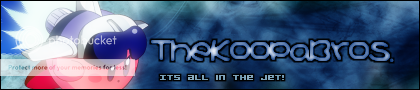
TheKoopaBros.'s Advanced Gimp Signature Tutorial!
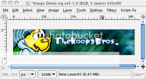
In this tutorial I will be teaching you how to make Signatures such as these:


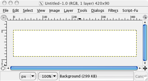
Step 1: Starting out and making your background
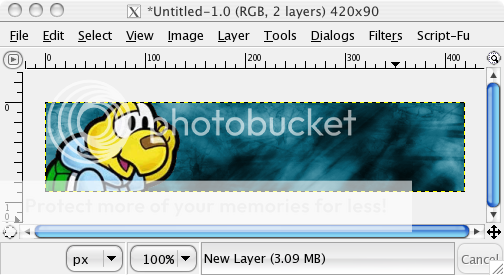
I'm starting off with a New Window in Gimp. Dimensions are 420 pixels wide by 90 pixels high (image below for reference).
Now click on the paintbrush icon, and down in the lower menu there
should be a scroll bar entitled "Opacity". Move that down to about 60%
or so.
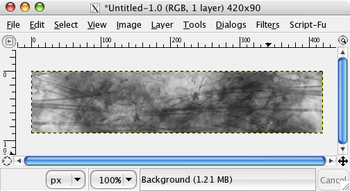
Now select a grunge brush (I used the AbstractChaos brush set).
Note: If you need to find brushes for Gimp, boot up Google, type in
"Deviant Art Gimp Brushes" then click on the first link. To install
those brushes, follow this guide:
http://forums.nintendo.com/nintendo/boa ... =0#M412824
Brush on your sig using different brushes until most of it is covered. It may resemble the below image, now:
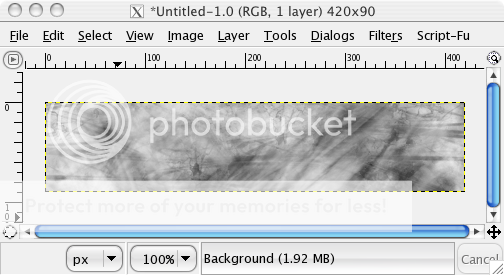
Now click on the black rectangle in the center of the tool menu.
Double click on it and select the colour white. Now pick out a soft
brush, and start brushing on top of your grunge brushed background. I
used the Leiyla brush sets for this.
Now don't go overboard when you're doing this. In the end you still
want to be able to make out at least some of the black background you
started with. Here is what I came up with after a few brushes:
The next thing that you should do is this:
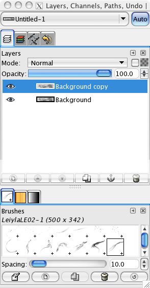
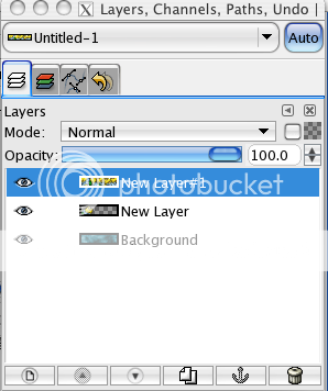
In your layer window you should be working on your "Background
layer". Right click (Ctrl + Click for Mac's) on that layer, and select
"Duplicate layer".
Your layer window should now look like this:
Now select that duplicated layer, and go to Filters->Blur->Gaussian Blur.
Put in these settings:
Blur radius:
Horizontal: 13
Vertical: 13
Blur Method: IIR
Now hit OK.
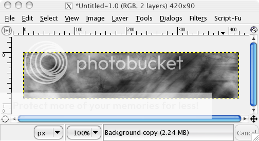
Your signature should now look extremely blurry. Now under the
layers window, and under "Mode:" click, and scroll down until you come
across Multiply.
Note: Overlay, Burn, Hard light, Soft light and Grain Merge can also work well.
What this does is that it brings out the light or dark colours of the signature (depending on which blend mode you use).
Here is what I came up with:
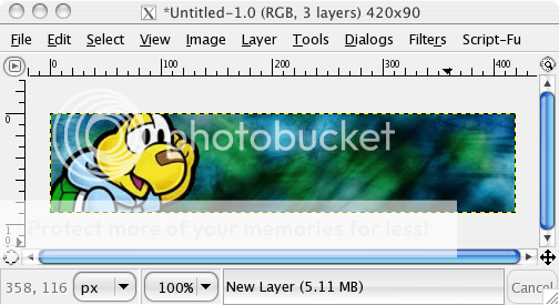
Now right click on your duplicated layer and select "Merge Down".
Now comes the background colouring part:
Now before deciding on a colour, its often a good idea to figure
out what render you're planning on using. If you're render matches the
background it can make the signature as a whole look nicer and stand
out.
Since I'm planning on using a render of Koops (which is yellow and
blue), I'll make the background a light blue-turquoise colour to match
him.
Now if you have decided on your colour, lets continue on...
With your background layer selected go to Tools->Color
Tools->Colorize. Play around with the scroll bars "hue",
"saturation" and "lightness" until you're content.
Since I'm making a light blue background I used the following:
Hue: 192
Saturation: 84
Lightness: 12
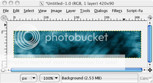
The result is this:
Step 2: Inserting and touching up your render
Now its time to insert the render.
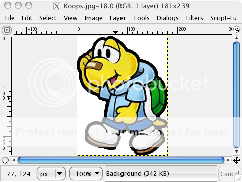
As I mentioned earlier, I'm using a Koops Render:
Now, as I've used in my past tutorials, I'll be using the Magic
Wand tool. I'm not going into great detail, so if you're stuck, please
PM me or read my other simpler tutorials.
Take the magic wand tool, click on the background, now go to Select->Invert.
Now cut the render out.
Now, switch back to your signature. Go to Layer->New Layer, and
then paste your render into it. If the render is too big or facing the
wrong way you can correct this by going to Layer->"Scale Layer" and
Layer->Transform->"Flip Horizontally".
Now once you have it where you want it, anchor the layer by clicking outside of the signature.
This is what I came up with:
Note: Now be warned, from this point onwards this tutorial will become increasingly difficult. You have been warned. >=D
Now make a new layer, then paste the Koops render again, and again,
again until Koops's fill the entire screen. Everything must be covered.
This may seem silly, but you'll see soon enough its purpose.
Your layers window should look like this:
Now with that layer selected (Lots o' koops one) go to
Filters->Blur->Gaussian Blur. Set this at anything above 18
horiz. and vert, hit OK.
Now under "Mode" in the layer window select "Overlay". Now take
your original Koops layer and move it up above the
Blurred-Overlayed-Koops layer.
Your image should look something like this:
Now select your original Koops layer, duplicate it, now go to Filters->Blur->Gaussian Blur. Set both axis as 18 or so.
Now set that duplicated layer as "Overlay". What this does is
emphasizes or brightens certain colours. Its a useful tool for creating
a warmer feel to a render.
Again, other blending styles can create different results. Experiment with them!
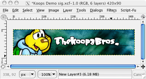
Step 3: Adding text and text effects
Now for the text:
Pick out a font that you want for the main text of the signature:
I picked the font "JellyBelly". Select white as a colour, then type
out your screen name. Now center the text onto your sig, then anchor
it.
Now go to layers->Transparency->Alpha to Selection. Now make a new layer, and move it BELOW the text layer.
Now make sure that your default colour is black, then got to
Edit->"Stroke Selection". Under "Stroke Line" select "3", then hit
OK.
Now unselect everything, then select the text layer and merge it down onto the stroked text layer.
It should now look like this:
Now duplicate your text layer, put a Gaussian Blur of 8 (or less)
on the layer, then and set the duplicated, top layer to "Darken Only".
Now merge down that layer over top of your text layer.
Now go to Colorize, and input the settings that you originally set for the background (or something similar).
Hit OK.
Your sig should now look like this:
Now that this is finished, its time to work on the sub text (if you want it).
Now select the text tool, and pick a font. For best results use a pixelated or bitmap font.
I used the font "Acknowledge TT (BRK)" under size "14".
Now go to Layer->Transparency->Add alpha to Selection, make a
new layer below, edit->Stroke Selection, but put the stroke line
size to 2.7.
Now, merge down the text layer onto the stroked layer, position the text, and it should look like this:
Now you can leave the sub text as is, if you'd like, but if you
want to try a different effect select the blending mode "Value" while
selecting the sub text layer.
Step 4: Finishing up and adding a border
Now finally the border.
Simply put a border of ANY kind makes any signature look better. If you have a chance to do so, DO SO.

Here are two ways of making borders:
# 1:
Make a new layer, place the layer above both of the renders. Now go
to Select->All, then go to Edit->Stroke Selection. Make sure
black is the default colour, make the stroke line "2", then hit OK.
# 2:
Make a new layer, place the layer above both of the renders. Now go
to Select->All, then go to Edit->Stroke Selection. Now with black
as the current colour go to stroke size 10, then switch to white,
stroke size 8, now switch back to black and select 5 or 6. Now using
that layer set it to Overlay.
Examples of borders on this sig:
With #1 Border:

With # 2 Border:
With no border:

See what the difference a border can make?
And THAT! Sums of my tutorial!
I hope you liked it, and happy gimping to you all! ^_^
If you don't understand anything in this tutorial please let me know as soon as possible!
If you've made anything with this tutorial, please post your results.


